Dialogue, dialect, and expectations

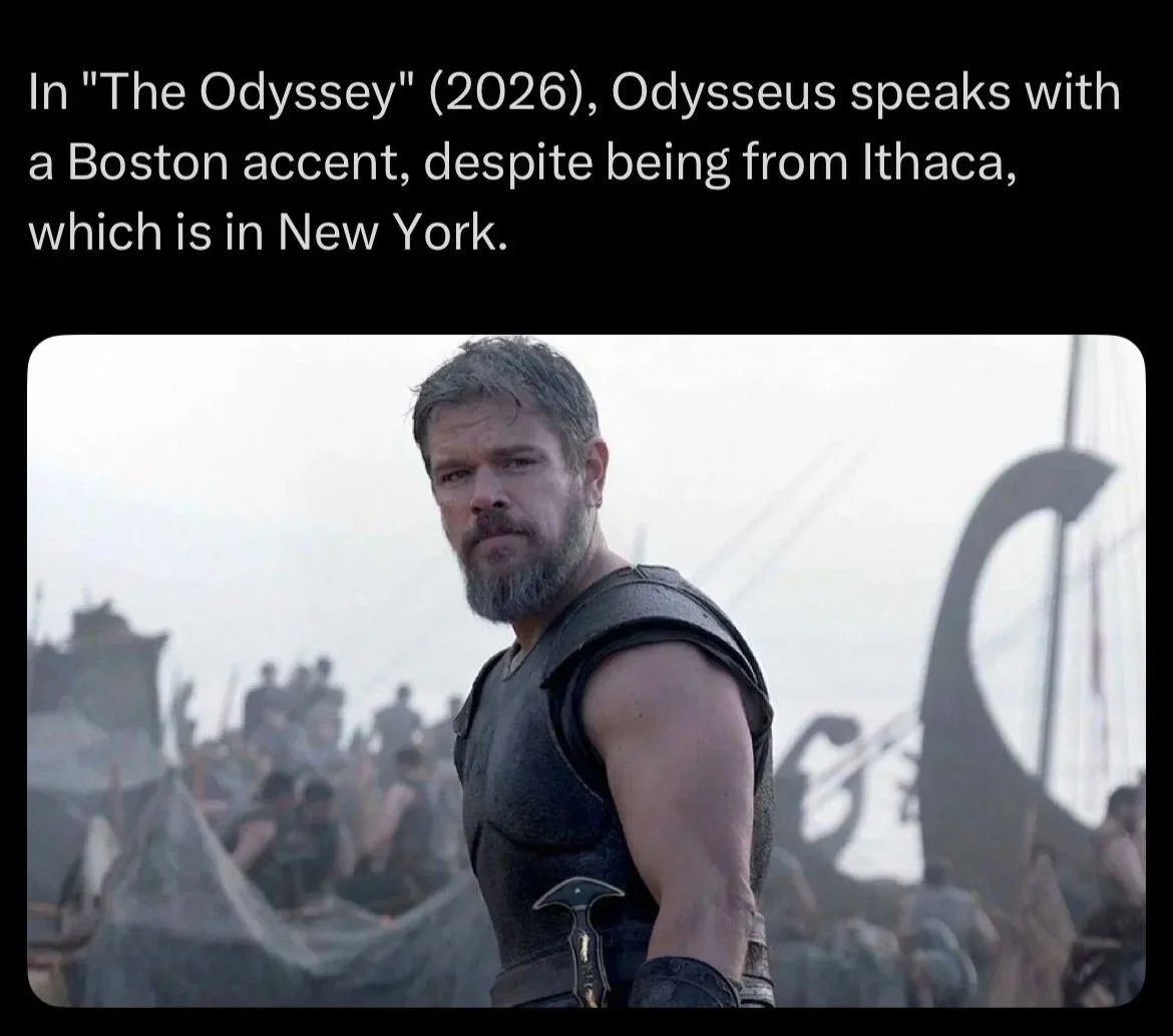
Back at the end of last month I made a dumb joke on Substack that went viral. A classical educator I follow shared this meme, which he captioned “Finally, dealing with the real issues…”


I restacked it and added, on the spur of the moment, “Muse, sing of a guy who was wicked smart…”

I don’t keep close track of my Substack analytics but I think this is now the most widely viewed thing I’ve shared on there. That was May 31st, and June is about to end and I still get multiple notifications a day that someone has liked it or restacked it or—the point of this post—commented on it. And the people commenting on it have made the same highly original joke over and over for a month. Maybe it’s already crossed your mind as you read my silly invocation above:

That should say “wicked smaht.”

I haven’t counted but I’ve gotten at least a dozen, maybe two dozen, versions of that joke. It’s actually given me cause to think, again, about writing dialect.

My abortive series of long-form posts on Elmore Leonard’s ten rules of writing ended with a single post about dialect. Leonard’s rule: “Use regional dialect, patois, sparingly.” After examining several long passages from different novels featuring different approaches to writing dialect, I arrived at six general guidelines, my personal approach to the problem. What I think is one of the most important is: “Keep phonetic spelling to a minimum, using it always to suggest a broader pattern that you don’t render.”

I have striven to follow this guideline, letting syntax and vocabulary suggest the way a character pronounces words—so that the reader hears it in his head—rather than spelling the pronunciation out. Heavy use of phonetic spelling becomes difficult to read, distracting, or, at worst, insulting to the dialect being rendered. But.

But sometimes some words are so distinctive to the way a dialect is spoken they become emblematic of that dialect. The result is that writing even a line of dialect speech that does not spell a distinctive word phonetically will be interpreted by the reader as a failure. An unforeseen pitfall, one I fell straight into.

In the 2004 film The Alamo, Billy Bob Thornton’s David Crockett only wears his buckskins and coonskin cap for what amount to PR appearances. When questioned by Jim Bowie about his hat later (“What happened to your cap? Crawl away?”), Crockett confesses to wearing it only because of his popular image: “People expect things.”

A useful point to keep in mind when writing dialect. Even as a joke.

Latitude and the borders of the possible

For Father’s Day my wife gave me a gift card to a brand-new local bookstore. I used it to pick up, at long last, a copy of AS Byatt’s Possession, first recommended to me years ago by my best friend at Clemson. The novel’s epigraph, a passage from Hawthorne’s preface to The House of the Seven Gables, struck me:

When a writer calls his work a Romance, it need hardly be observed that he wishes to claim a certain latitude, both as to its fashion and material, which he would not have felt himself entitled to assume had he professed to be writing a Novel. The latter form of composition is presumed to aim at a very minute fidelity, not merely to the possible, but to the probable and ordinary course of man’s experience. The former—while, as a work of art, it must rigidly subject itself to laws, and while it sins unpardonably so far as it may swerve aside from the truth of the human heart—has fairly a right to present that truth under circumstances, to a great extent, of the writer’s own choosing or creation.

“Romance” here hewing closer to its original medieval meaning of “adventure.”

As it happens, just yesterday I finished rereading The Thirty-Nine Steps for the fifth or sixth time—and the first time I’ve revisited a book for John Buchan June. Buchan’s dedication, to his friend and publisher Tommy Nelson, includes this oft-reprinted explanation of the kinds of books Buchan liked—and wrote:

You and I have long cherished an affection for that elemental type of tale which Americans call the “dime novel” and which we know as the “shocker”—the romance where the incidents defy the probabilities, and march just inside the borders of the possible.

There’s that word romance again.

Just the other day I saw an ordinarily thoughtful Substacker assert that condemning TV while reading “plot-driven genre fiction” was hypocritical, as the latter was no different from the former; the reader just holds his head in a different position from the TV viewer. This is not the stupidest thing I’ve seen online recently but it wasn’t far off.

First, there is nothing wrong with reading for entertainment. I’d even argue, as I will momentarily, that a book should at the very least entertain, whatever its subject. But the romance, the story that stays “just inside the borders of the possible” and for which the reader must—but most often quite gladly—grants “a certain latitude,” need not be mere entertainment. A good plot and a little excitement open the imagination to truth and argument better than any bluntly stated thesis. If genre fiction is nothing more than brainrot, why have our most gifted writers turned their hands to it over and over for centuries? Why did Jesus tell pointed, engaging, and surprising stories in popular forms?

Per CS Lewis, for whom the fantasy stories of George MacDonald “baptised” his “imagination” long before the arguments of his friends Tolkien and Hugo Dyson could reach him, “every book should be entertaining. A good book will be more; it must not be less.”

Buchan and Hawthorne could hardly be more different, but I appreciated the consonance between their explanations of what the novelist who aims for something more striking than kitchen-sink realism—Hawthorne’s “very minute fidelity”—dull modern or postmodern rumination, or pure didacticism must do. The reader willing to grant that latitude and march with the author on the ragged edge of believability should, if the author knows what he’s about, be amply rewarded.

* * * * *

Our new bookstore is a small local brand of M Judson of Greenville. Check them out here. I reviewed The Thirty-Nine Steps for the very first John Buchan June in 2022. You can read that here. Last year I reflected on the duty of the good writer—in this case, Len Deighton and Ian Fleming—to entertain as a prerequisite to doing more here. And yesterday I recorded a podcast with a longtime reader about Buchan and The Thirty-Nine Steps specifically, a conversation I’m excited to share with y’all. Be on the lookout.

On audacity and plausibility

Earlier this week I got the chance to catch up with my friend JP Burten. We were talking about a recent writing project of his that involves Bitcoin as a plot element and he noted, as an aside, that he doesn’t really know anything about cryptocurrency. Could’ve fooled me, I said. I found his use of it for the purposes of his story completely believable.

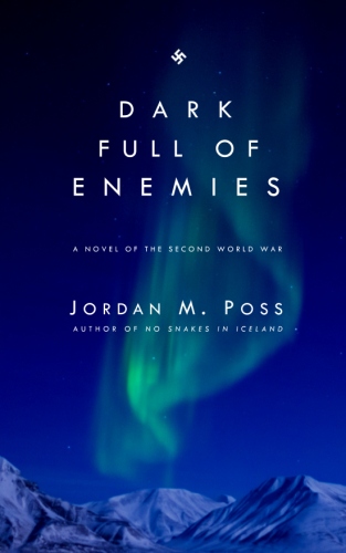
I related my own plausibility story. In Dark Full of Enemies, Colour Sergeant Graves, the commando team’s explosives expert, carries a small tin of thermite with him for improvisatory use. In the sabotage scenes leading to the novel’s climax, the team uses some of this to melt the steel doors of the dam shut, sealing in the main explosive charge and thwarting German efforts to counterattack and remove them. I put a lot of imaginative effort into this passage and was pretty pleased with it, especially as a chance to play with the Arctic winter setting and theme of darkness:

McKay took the tin and went to the end of the gallery. At the steel door he took out a wad of thermite, prepared by Graves at the Petersen house, and a match and squashed it into the gap in the jamb, just above the lock. He set the bolt and lit the thermite.

The little wad caught and burned white. Molten steel fizzled and guttered in sun-bright globs onto the floor. The tunnel lit up—McKay shut his eyes. He had not seen real light for days. Yellow metal coursed in runnels down the jamb, cooling as it went. A minute later, and only the lock still glowed. The rest of the door stood smoking, fused shut.

“I’ll be damned,” McKay said.

He set another pinch of thermite in the jamb just above the lower hinge, set it aflame, and left.

But—I have no idea whether that would work. I did research on thermite (and knew more about it then than I remember now) but never determined whether one could use it the way Graves does. And yet no one has ever called that out as unrealistic, even the technically-minded Tom Clancy fans who’ve taken a look at Dark Full of Enemies and enjoyed it. Whether it’s possible or not, it came across as plausible enough to work.

Per my discussion with JP, the writer can—and should—do research and plan and prepare, but sometimes what sells something questionable is pure confidence. Whether a technical detail like these two or a plot contrivance or coincidence, present it without blinking and it’ll seem plausible. Believability is the daughter of audacity.

This requires art and good judgement and is no substitute for actually knowing things but, like Graves’s tin of thermite, it’ll do in a pinch.

Our conversation was prompted by JP’s new novella Dead Drop, a followup to his mystery The 8-Bit Detective, an internet-age cozy mystery. Dead Drop is a fun, tightly constructed short read and available free on his website.

The writing rule everyone misses

A recently popular genre of Substack note—judging by what the algorithm sends my way, anyway—is complaining by writers about “rules” for writing. These frequently take the form of fulminations against old advice to avoid adverbs. To paraphrase one note, which if I remember correctly was originally much ruder, “Every adverb I write is a little screw you to Stephen King.” More broadly, some will argue that the there are no rules for good writing and even to formulate rules is a kind of tyranny or imposition or—for a special subset of writers who self-consciously posture as independent outsiders—the mark of the dreaded “MFA writing.

I can’t speak for every writer who has ever laid out a list of rules for their own writing, but these Substack warriors could save themselves a lot of time and lower their blood pressure by noticing one all-important caveat or disclaimer in every good list of rules I’ve ever seen: break the rules if breaking them will produce better writing.

In the early days of the blog I collected three sets of writing rules from three favorite writers: CS Lewis, George Orwell, and Elmore Leonard. They have areas of broad overlap, especially a concern with precision and clarity, but here’s perhaps the most important:

  • Orwell: “Break any of these rules sooner than say anything outright barbarous.”

  • Leonard: “If you have a facility for language and imagery and the sound of your voice pleases you, invisibility is not what you are after, and you can skip the rules.”

Orwell’s rule comes at the end of his list; Leonard’s before he even lays his out. They’re emphasizing that these are their rules for how they write, a set of strictures that they have found effective, but space must remain for artistic judgment. This rubbishes another species of Substack complaint about rules, one often leveled at Orwell specific: that of hypocrisy.

Most of the complaints I’ve seen about rules for writing stem from a misapplication of or unwarranted rigidity in a using particular set of rules. This is a legitimate problem. The rule against adverbs exists not because adverbs are inherently bad, but because they become a crutch for weak writers. Most of the items prohibited by lists of rules have this temptation about them: overuse of adverbs can cause verbs, where the action happens, to atrophy; overspecific dialogue tags can, in addition to reading clumsily, bear more of a burden of information than the dialogue itself; passive voice can become an unthinking habit until the involuted relation of subject and verb in repeated passive sentences kills the pace of writing. Noticing and controlling these effects is necessary for strong prose; never, ever using an adverb or passive voice is something a high school English teacher might enforce (indeed, I know specific examples), but is an overreaction.

Again—the authors who lay out these rules usually say exactly that. These rules aren’t hard and fast. These rules aren’t universal. Sometimes you must break them. After all, they’re my rules.

One would think that would settle it, but some of these complaints also seem born of willful misunderstanding or mere resentment. This isn’t limited to Substack writers: I was surprised several years ago to see Ursula Le Guin taking an obvious potshot at Leonard in her book on writing. She took much the same tack, talking about his rules as if they are obviously phony and accusing him of hypocrisy. She was wrong, and the complainers are wrong.

Most crucially, rejecting or refusing even to consider rules and constraints will warp a writer’s artistic judgment. Any attempt to be bold or daring must begin at a baseline, because without that one cannot make judgments about what does and doesn’t work, and a writer who never works within constraints will never grow. Writing without rules is no more feasible than living without them.

* * * * *

Addendum: Even Strunk and White, who are the object of a Two Minutes Hate that comes in almost predictable cycles, were trying to train the sensibilities of beginners, not lay down eternal laws of good writing. One can write well while ignoring their advice, but not until it’s become a conscious decision, not a habit one slips into.

Preliminary notes on worldbuilding

Over the weekend I started reading my first Star Wars novel, Heir to the Empire, by Timothy Zahn. This isn’t my usual fare but it came highly recommended enough by enough trusted friends that I finally picked up a copy last year. I’m enjoying it.

What I’ve found especially enjoyable is the convincing post-Return of the Jedi situation Zahn imagines: the Empire struggling to recoup its losses, especially in manpower, and calling in reserves from the outer edges of its reach, and the Rebellion threatened by diverging priorities, in-fighting, overconfidence, and poor choices leading to bad PR. Grand Admiral Thrawn is not unlike “Hitler’s Fireman,” Field Marshal Walter Model, being rushed from one doomed campaign to another on the strength of his tactical acumen, and this outcome for the Rebellion will be familiar to anyone who saw Lawrence of Arabia or who has studied the American Revolution in real depth. (It is, in fact, the better outcome, since the members of most resistance movements end up like the protagonists of Rogue One, the most realistic Star Wars movie.)

That is, Heir to the Empire has good worldbuilding.

I hate the term worldbuilding.

It was cute as a term for what novelists, especially those dealing in fantastical or unfamiliar worlds, have to do to make their stories believable the first 10,000 times I heard it. But the more I heard it the less I liked it, or at least the way it was used—especially when it was used as a single criterion for praise of condemnation of a novel.

At any rate, Heir to the Empire got me thinking about this topic again, and I wanted to get some of my thoughts and misgivings about it down in writing. Consider the following informal preliminary notes toward a full account of worldbuilding.

As I conceive of it, “good” worldbuilding works along or toward the following aspects of a story:

  • Plausibility

  • Complication

  • Depth

  • Thoroughness

In addition to their obvious purposes—any story should be plausible, right? and “deep” is always preferable to “shallow”—the first three should all suggest the fourth.

This brings me back, as so often, to John Gardner’s “fictive dream.” I’ve written about this in much more detail before, but the short version is that fiction works like a dream in absorbing the dreamer’s attention with a situation and story that are unquestionably real as long as the dream endures. It should be “vivid and continuous,” with the reader’s senses convinced by carefully selected concrete details and nothing to distract and “awaken” them.

Gardner’s conception of fiction as a dream is key to my own understanding of writing, but if it is missing or fails to account for anything it is the strangest and most uncanny aspect of dreaming. In a real dream, we simply know a lot of things beyond the specific events and details of the dream itself. A dream comes prepackaged with unexplained context. This is often the most difficult part of a dream to explain to whatever patient person you’re telling about it: “I was in the lobby at work, but it wasn’t really the lobby, it was an airport terminal, and I was there to…”

Worldbuilding’s best and most proper function, I think, is to fulfil this role, to provide context for what is assumed by the characters within the story. Because really vivid characters will seem to have existed before your story begins, in a world that was carrying on without waiting for you, the writer, or the reader to show up.

I have two basic problems with worldbuilding as it is popularly talked about. The first arises with the verbs I keep using: seem just now, and suggest above.

There is no law governing how much worldbuilding an author should or must do for a given story. It’s going to depend on the story. A novel about ordinary people with nine-to-five jobs set last year will not need a lot of deliberate, calculated explanation. A story set in, say, the marches between the native Britons and the invading Anglo-Saxons in AD 550, or in a fantasy world, or in a galaxy far far away, will require much more. In writing a novel like these, some authors will lay it on with a trowel, and some readers will complain if they don’t.

But worldbuilding works best by suggesting thoroughness. The full world imagined by the writer should come through organically, without a lot of direct explanation, and “build” through allusive power that also characterizes and advances the plot. This requires skill and art. The infodump—which is not the same thing as exposition—does not. The writer must resist to urge to put every detail on the page. They must know what to leave out.

Pro and con examples: Tolkien is the paradigmatic example of allusive, suggestive worldbuilding done well. People who complain about the long songs or mentions of “irrelevant” legends of historical characters miss this dimension of his storytelling and read an impoverished version of his work. Robert Jordan, on the other, hand, actually does most of the things people accuse Tolkien of doing: going off on tangents, bringing the story to a halt for extraneous info, overexplaining, overdescribing, overstuffing.

My second problem with worldbuilding is that, as much as it is discussed as some special characteristic of fantasy, science fiction, or some other genre, it is something all writers of all fiction should be doing. Indeed, if they’re doing a good job of writing fiction at all, they’re already doing it. It is inseparable from imagination and good craftsmanship and is, ultimately, a meaningless subcategory of creativity. See again Gardner’s fictive dream.

Again, these are notes on the subject, not an exhaustive treatment. I may revisit the topic again soon, especially if having gotten this into writing I’m able to refine my thoughts.

Does it matter if the movie is faithful to the book?

Over the weekend Substack, in its mysterious way, showed me a month-old note by a literary critic I follow and respect. Since this is a month old and there was already some debate along these lines in the comments, I’ll share and gloss it anonymously:

It doesn’t matter if the film is faithful to the book.
It’s a film! Judge it as a film.
And anyway, you cannot faithfully turn prose into film.
It’s an affront to literary genius to think otherwise.

I’m not actually sure what the last line is supposed to mean. How does holding a filmmaker to a high standard when adapting a writer’s work degrade the writer? But I strenuously object to the rest of it.

To work backwards, the critic here is asserting that the difficulty of adaptation from one medium into another actually makes it impossible—“you cannot faithfully” adapt from book to film, he says. An appalling oversimplification. What does he mean by “prose,” here? When we talk about how a book is adapted into a film and the film isn’t faithful, we might mean it fails with regard to one or more of the following:

  • The literal events of the book

  • The overall story arc of the book

  • Particular details of the settings and/or characters

  • The narrative structure of the book

  • The meaning or thematic import of the book

  • The tone of the book

I’ve tried to arrange that list from simplest to most complex. The events narrated in a story are the easiest to get on screen. The meaning, what the author is apparently both getting out of the story and trying to share through it, and the tone of his storytelling are much harder. We’ve probably all seen movies that more or less adapted a book’s events without capturing the immaterial elements that give the book personality. A Handful of Dust, a quite literal adaptation of the great Waugh novel, comes to mind, as does the John Wayne True Grit. But other films might deviate here and there from the original while nailing its tone and moral register. The Coens’ No Country for Old Men and True Grit, both of which capture most of the events of their respective novels while, much more importantly, faithfully adapting their tones, are masterpieces in this regard.

All of this, according to our critic, is just “prose,” which “cannot faithfully” be made into a film. Cannot. This is not only oversimplified but wrong. Adaptation is difficult, but that we want to judge faithfulness at all indicates that it can be done, and can be done well.

Our critic is on firmer ground in asserting that films and books should be judged by different artistic standards, but this is common sense. Novels and movies tell stories in different ways and may or may not do so well, of course. But—still moving backwards—to assert a novel and its film adaptation are so separate that “it doesn’t matter” whether the adaptation is true to the book is foolishness.

Of course it matters. It matters because if a film adaptation of a book exists it exists because of the book. If a movie presumes to share a title with an author’s book, if it is meant to please readers of the book at all and not to be purely parasitic on the writer’s work and readership—we’re all familiar with the term cash-grab by now—the filmmakers owe it to the book to be faithful in at least some of the areas listed above. And having established that faithfulness is not, in fact, impossible, they owe it to the original to try.

I think it also matters because this kind of talk about the difficulty or impossibility of faithful adaptation has far too often served as an excuse for vandalism. Some vandalism originates with filmmakers contemptuous of their literary source material and wanting to drag it down to their level. Some comes from filmmakers who hubristically think they can improve on great literature. But perhaps the most common problem is the filmmaker with neither contempt nor reverence for the original, who sees it only as raw material to be reworked according to his preferences. It’s all content, after all.

This was my problem with two of the worst film adaptations I’ve seen in the last few years, The Green Knight and All Quiet on the Western Front, both of which—if you look at my reviews—I tried to judge on their merits as films while also noting their utter failure as adaptations. They don’t adapt the events, characters, meaning, or tone of the originals even a little bit faithfully. Are we to give them a pass because they have nice cinematography? Because they try to flatter our present assumptions?

There are other reasons to demand faithfulness of a film adaptation—the movie may be the one and only time many viewers, especially students, encounter any version of an author’s story—but these, I think, are the strongest. There is room for debate, of course. Arguments about whether and how Peter Jackson succeeded in adapting The Lord of the Rings, for example, have been fruitful for an appreciation of both the film trilogy and the novel. But handwaving even the possibility of faithfully adapting a book is bad for both.

A film might be just a film, but a film based on a book exists in relation to that book. If an author cared enough to write it and readers cared enough to read it, filmmakers owe them something more than apathy, hubris, or contempt. So do critics.

Dispatches from the butt-covering trenches

Earlier this week I received an exciting curiosity: a paperback of The Maltese Falcon in a simulated Armed Services Edition design from Field Notes, my favorite notebook company. Armed Services Editions were pocket-sized paperback books made available for free to GIs during World War II. Over a hundred million ASEs were handed out over the course of the war, and servicemen could enjoy any one of 1300 titles—not including The Maltese Falcon, which Field Notes is belatedly adding to the corpus.

Field Notes’s Maltese Falcon. So cool I can’t stand it.

So this is a cool, fun project at the intersection of several of my interests—history, literature, World War II, and crime fiction—from a company I’ve patronized a long time (my oldest Field Notes are full of sketches and notes for my books, both old and forthcoming). And I’m glad to say the final product is mostly great.

I have no complaints about the quality, the design—which is indistinguishable from a real ASE—and the editorial choices in preparing the text of Hammett’s book, namely the original serialized magazine version. But Field Notes includes an introduction from a novelist who, after explaining the greatness of Hammett’s novel, its place in American crime and mystery fiction, and those editorial choices, drops in the dread one-line paragraph: “It is also a product of its time.”

From two pages of praise he turns to three and a half of apologizing for Sam Spade’s “misogyny,” for Hammett’s “century-old gender stereotypes,” that a villain is portrayed as Middle Eastern and that other characters speculate that he is a homosexual—both aggressions thus “other[ing] him”—and so forth. The novelist tries to muster some feeble goodwill for Hammett by assuring the right-thinking reader that Hammett “was a dedicated anti-fascist* and leftwing activist” and argues that Hammett was actually trying to subvert the benighted standards under which he labored.

It’s tiresome. Like that new edition of The Martian Chronicles I wrote about earlier this year, this is butt-covering on the part of the publisher, a cringing posture of “Don’t be mad at me!” Either introduce a great novel with an argument for its greatness—placing the burden of being a ninny upon the reader, who must decide whether or not to reject it at the first sign of disagreement—or don’t bother at all.

By all means, get yourself a copy of Field Notes’ ASE Maltese Falcon, but skip the introduction. It’s tedious but predictable—a known quantity—and at least the book isn’t censored (as far as I can tell). The other item I noted this week is more sinister.

While picking up some gifts for the kids at Barnes & Noble I stumbled across brand new Vintage editions of James Ellroy’s LA Quartet. Having read The Black Dahlia in college I’ve been meaning to read LA Confidential and the others for years, and considered seizing this opportunity to pick one up. But then I stumbled across this note on the copyright page:

While this book is an outstanding work in the genre, it is also firmly of the time and place—the American 1950s. This book may contain outdated cultural representations and language.

Not only does that first sentence make no grammatical sense—great job, Vintage—it somehow elides Ellroy’s historical fiction with reality, implying that the grungy, lurid world he evokes was the norm.

While this was a fairly standard butt-covering publisher’s note of the kind I’ve looked at here before, it raised my suspicions. After a minute of browsing I spotted a censored slur in an early chapter—rendered with the first letter and a dash—and a few others on adjacent pages. And it was only specific slurs; every other vile word typical of Ellroy’s dialogue was rendered intact.** As it happens, there was an old movie tie-in paperback of LA Confidential on the shelf nearby. I checked the new edition against the old one. Not a word in the original, no matter how offensive, is obscured in this way.

Vintage has censored Ellroy’s books. Further, they have censored them without indicating that they have done so.

I’ve been griping about this happening to long-dead authors for a while—Ian Fleming, Roald Dahl, Agatha Christie, et al—but Ellroy is still alive, still publishing, still giving his manic interviews. And I couldn’t help wondering—is there any other author who would be less cool with this? Part of the point of Ellroy’s fiction, like it or not, is confrontation. His work is in-your-face, gritty and grimy and disturbing to a punishing degree. Softening even part of it for some sensitive suburbanite who picked up an Ellroy novel not knowing what she (and it’s definitely she) is getting into doesn’t just betray Ellroy, it undermines his artistic purpose.

I checked Ellroy’s official website. I don’t know how personally involved he is with it, but he is either fine with the censorship—which seems out of character—or unaware of it. In an announcement for the new Vintage paperbacks, his site declares: “Same great books, great new look inside and out!”

Except that they aren’t the same.

An interesting and frustrating new wrinkle in this story. We’re not out of the woods yet. (Addendum: much like the Fleming estate did with the Bond novels, Ellroy’s audiobooks have been rereleased in censored versions, too.) In the meantime, continue to favor older, unexpurgated editions where you can find them, and always be alert to publisher meddling—even for living authors.

* Indeed, Hammett was such an honest, hardworking anti-fascist that his Stalinist lover Lillian Hellman publicly wished for the Russian conquest of Finland. If we’re worried about an author’s problematic views, why doesn’t that enter the picture?

** This is itself revealing of vast taboos that lie well beyond the scope of a blog post but are worth thinking about.

Five basic typesetting fixes for self-publishing

I’m currently reading The Cruel Sea, a 1951 novel about the Battle of the Atlantic by Nicholas Monsarrat. A few days ago on Substack I shared a few pictures of the interior of the book, simply but beautifully designed and set in Janson, a readable typeface still in wide use today.

In my note I called this kind of mid-century design “typographical comfort food.” A number of people agreed, noting the “visual delight” of the look of the page and that good typesetting makes it feel “like I can breathe through my eyes” reading it. Another, very much to the point, described the reassurance that comes with good type design: “You know you’re in good hands.”

This last comment is particularly important because at least two others remarked on self-published books in this context. One, an author of sci-fi, said he took this aspect of books for granted until he started publishing his own work, at which point he realized “it really does make a difference!” Another, slightly more dourly, wrote of the need to undo the damage done by desktop publishing.

I don’t know so much about widespread damage, but self-published books very often look bad at the page level. I’ve certainly put books back on the shelf after looking at an unreadable interior. But I’ve been doing desktop publishing of one kind or another as an amateur for thirty years, and—through a lot of trial and error and, crucially, just looking at a lot of books—have learned a lot about what makes the interior of a book look like a book. I’m no expert, but what I hope to offer here are a handful of specific things people designing their own books can do to make sure readers focus on the writing and not on shoddy typography.

Paragraph spacing

A lot of the problems I see with self-published books come from designing the interior of the book in a program like Word. This by itself is not a problem—I’ve laid out all of my books in Word. The problem is leaving Word’s often moronic default settings in place.

Among the worst of these is Word’s automatic insertion of a space between paragraphs. No professionally published book does this, and to a potential reader, even one who doesn’t know much about design or publishing, it won’t look right. Something will feel off.

This setting can be corrected in the paragraph formatting menu. Under the “Spacing” section, you’ll want to make sure that both “spacing before” and “spacing after” are set to zero.

Level up: Word’s default indentation is set to half an inch (.5”). Finished books don’t indent paragraphs this much. Reset it to .2” or .25”.

Line spacing

Manuscripts may be double-spaced, but a finished book should be single-spaced. You may occasionally see a professionally published book fiddle with the line spacing a bit—1.1 or 1.2 between lines, for instance—but the lines will always be closer to single-spaced than otherwise and precisely how this looks on the page will depend somewhat on the typeface or font (about which more below). Again, too much space between the lines won’t look right.

Like paragraph spacing, this is adjustable in the paragraph formatting menu.

Faith through justification

“Alignment” is how the text in a manuscript lines up with the margins. Word’s default is the entirely sensible “left aligned,” meaning the text will be flush with the left margin but not the right. Professionally published books are “justified,” meaning the text reaches all the way to the right margin on every line (except for the last sentence of a paragraph). This used to be a painstaking task for old-fashioned printers, who had a variety of ways to scootch and squish the text to fit the length of a line, but computers adjust the text to fit the margins automatically. Simply highlight the text and, out of the four alignment buttons, click “justify.”

Caveat: publishers do occasionally get artsy and toy with unjustified text with “ragged” edged paragraphs (my CSB Reader’s Bible has unjustified text), but I’ve never met anyone who actually likes this when they see it. Err on the side of traditional standards.

Level up: Be aware that, once you’ve justified the text of your manuscript, you’ll probably want to go through it looking for places where justification has opened huge gaps between the words on a line. You can manually control hyphenation or letter spacing to fine-tune this.

Stay out of the gutter

Even competently designed self-published books sometimes misstep when it comes to setting up the margins of the page. This is not typically a make-or-break aspect of page design but can be off-putting to readers.

Pick up a dozen or so books at random and flip through, looking at the margins, and you’ll see a wide variety of designs and widths. What you won’t see, however, are margins so narrow that they allow the text to stretch all the way across the page, or margins that allow the text dip into the gutter, the middle of the book where the pages join. If the line is too long, it can tiring to the eye and difficult to see into the gutter, and you want your book design to eliminate as many physical obstacles to the act of reading as possible.

This is slightly more relative than some of the other tips I’m giving here, but in a normally sized paperback book (say 5x8”) the outer margin should be about half an inch. This can be the narrowest margin. The top of the page should be a bit wider, the bottom wider still (to accommodate a page number in the footer, for instance), but the inner margin by the gutter should be around half again as wide as the outer.

I’m still unsatisfied with the margins I laid out in my first published novel. My most recent book and the one I’m most pleased with in regard to margins, has an outer and bottom margins of .7”, a top margin of .6”, and an inner “gutter” margin of .9”. When setting this up in the margins menu in Word, be sure to select “mirror margins” to get the facing-page format of a published book.

Appropriate typefaces

Word’s default typeface or “font” all the way through my school and college years was 12-point Times New Roman (single-spaced, I’ll add). At some point when I was in graduate school someone somewhere at Microsoft decided to goof all of this up. They added that automatic line after a paragraph and reset the default font to 11-point Calibri.

The other defaults in this post are mostly basic manuscript format things you’ll need to adjust to make your book look like a book, but these default font settings are mindbogglingly stupid.

The best size for your text is going to depend on a few factors like the length of the book and how that affects the cost of manufacture. Like margins, what looks best is going to be partly a matter of judgment.

What is and is not an appropriate typeface for the text of a book is not. The problem with Word’s Calibri is that it’s sans-serif. (Here’s a quick primer on serifs.) Professionally published books may use a sans-serif typeface for chapter headings or other design elements, but the actual text itself should always be in a serif font for readability.

Fortunately, there are many, many of these available. A few of my personal favorites, what I like about them, and where you might sample them:

  • Bembo—a classic old-style typeface with a slightly old-fashioned look and elegant italics. You may see it in older Penguin Classics, religious books from Ignatius Press, or many John Grisham paperbacks.

  • Sabon—a modern typeface with well-balanced letters; it is also highly readable at all sizes, even down to footnote sizes like 6 points. Very widely used both for fiction and non-fiction now.

  • Dante—nicely balances old-style design with readability. You may see it in the Walt Longmire mysteries, Penguin Modern Classics fiction, or a variety of non-fiction books.

  • Minion—a relatively recent but widely used font that is highly readable but, in my opinion, a little bland. Frequently used for non-fiction but you will sometimes see it used for novels—like the Tor Essentials reprint of The Prestige that I read this fall.

  • Caslon—a nicely weighted typeface with elegant italics that suggests the old-fashioned printing press (it is often used for books on the American Revolution, and there are some varieties that look artificially weathered, like 300-year old pamphlets).

  • Baskerville—another classic, widely used by university presses and fiction publishers a few decades ago. Like Bembo and Caslon, it has as suggestion of class and history about it. You can see it in Susanna Clarke’s Jonathan Strange & Mr Norrell.

There are plenty of other good typefaces commonly used for professional typesetting, but any one of these will look better than Calibri, Times New Roman, or whatever Word’s default is tomorrow. If these don’t come pre-packaged with your edition of Word, they’re available online in either licensed or free generic versions.

Avoid:

  • Sans-serif fonts

  • Typewriter fonts like Courier

  • Slab-serif fonts, thick, heavy typefaces that are better used for titles or headings than the main body of text

  • Fonts designed to look like calligraphy or other handwriting

  • Whimsical fonts, of which there are many available

If what you’re after is professionalism and readability, you should pick something unobtrusive and clear.

Level up: With those strictures in mind, experiment with typefaces a bit. A choice of font doesn’t have to be strictly functional, it can suggest tone, add texture, or, like Caslon for those American Revolution books, suggest a time and place.

Conclusion

One of the challenges—or, if you enjoy this stuff like I do, one of the fun things—about self-publishing is that there are always things to fine-tune and improve. Again, the above is a list of basics that, even if they won’t give your self-published book perfect interior and type design, they’ll at least eliminate some of the most obvious mistakes or problems. As that one Substack commenter put it, you want potential readers to feel that they’re “in goods hands” just by looking inside. I hope y’all find it helpful.

Spurious, horrible, the worst kind

Earlier today I started reading Payment Deferred, a 1926 crime novel from the early career of CS Forester of Horatio Hornblower fame. A curious passage of description from the first chapter, when a long-lost relative arrives at an uncle’s London home and looks around:

For a moment the conversation flagged, and the boy, still a little shy, had leisure to look about him. These were the only relatives he had on earth, and he would like to make the most of them, although, he confessed to himself, he was not greatly attracted at first sight. The room was frankly hideous. The flowered wallpaper was covered with photographs and with the worst kind of engravings. The spurious marble mantelpiece was littered with horrible vases. Of the two armchairs one was covered with plush, the other with a chintz that blended unhappily with the wallpaper. The other chairs were plain bentwood ones. On a table in the window were dusty aspidistras in vast green china pots. In the armchair opposite him sat his uncle, in a shabby blue suit flagrantly spotted here and there. He was a small man, with sparse reddish hair and a bristling moustache of the same colour.

It continues from there at some length, but two things struck me about this passage:

The first is just how vague it is. The room is “hideous.” In what way? When Forester elaborates, we learn that the decor includes “the worst kind of engravings” and “horrible vases” set on a “spurious” mantel. The latter I take to mean that the marble is fake, but why are the vases “horrible”? Are they cheap? Broken? Out of fashion? Badly made? And just what are “the worst kind of engravings?” The 1920s equivalent of Thomas Kinkade? Cuttings from Victorian newspapers? Bookplates from Fanny Hill?

Forester clearly wants to impart the nephew’s impression of cheap, run-down living, but we get a better sense of his emotional response to the room than of what it actually looks like. Hideous, horrible, the worst kind—these could mean almost anything.

And yet—the second thing that struck me—it works. This should be bad writing, but isn’t. I think this is down to two things:

First, the description strengthens as the paragraph goes on, and it does so by becoming more particular and concrete. Compare the “horrible vases” with the “plain bentwood” chairs, the “dusty aspidistras in vast green china pots,” and the uncle himself. Shabbiness, inelegance, and neglect create a powerful but subtle sense not only of the place but the character of the people who live there. This is much better.

Second, even in the vague early parts of the description the verbs are strong. In fact, I think they do most of the work in the first several sentences, which is asking a lot of the repeatedly used to be, which I’ve written about before. But even in passive voice, “was covered with” and especially “was littered with” convey strong visual information of clutter, disorganization, and, again, neglect and further cues about the uncle and his family.

Every writer has his strengths and weaknesses. I’ve read only one other Forester novel, the excellent The Good Shepherd. This was published almost thirty years after Payment Deferred, but the two books share a strong interiority, not so much bringing us into as forcing us, claustrophobically, into the minds of the characters from page one. I remember no defects whatsoever in The Good Shepherd, so my suspicion is that passages like the above are the mark of his early career. He was only 27 when Payment Deferred was published, and it would be another eleven years before the first Hornblower book appeared.

At any rate, I’m already enjoying it, and seeing evidence of future greatness in early imperfection is always instructive.

Two dangers of colloquialism

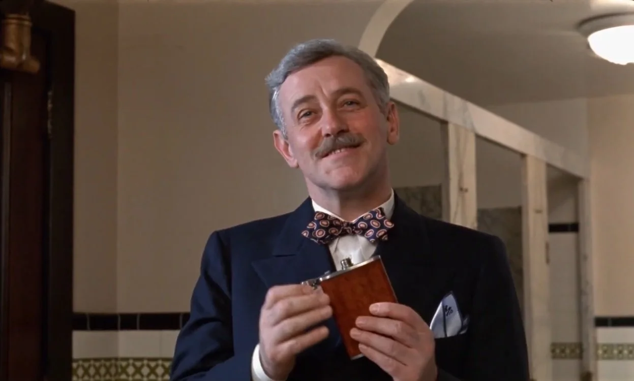
Failure to communicate. Strother Martin in Cool Hand Luke.

This has been a mad month, and on top of everything else keeping me busy I injured my right hand last week, so all the book reviews and other writing I had hoped to do over Thanksgiving Break came to nothing. For now. I’m glad to say I can type again, at least.

But if I had some enforced inactivity on the writing front over Thanksgiving, that at least gave me time to think. One topic I returned to several times was the danger of idiom, colloquialism, or unpredictable connotation in language. Two incidents—one-sided conversations overheard, really—separated by several years awakened me to two related aspects of the danger and drove home the need for clear and unmistakable meaning to me.

The more recent of the two came from a YouTube true crime channel that provides commentary on recorded police interviews. In one featured interview with a murder suspect, two detectives, a man and a woman, take turns applying pressure. It’s not exactly the good cop/bad cop routine, but the female cannily uses persuasion and emotional leverage while the male presses aggressively and confrontationally. Several times he uses the expression “come to Jesus” in the colloquial sense of a reckoning coming due, i.e. “It’s time to fess up.”

The YouTube narrator, apparently unaware of this common and (to me) obvious idiom, pauses to express outrage that the male detective is introducing religion to his interrogation and suggests his obsession with Jesus is undermining the female detective’s technique. Commenters also showed their ignorance—and, this being the internet, their violent irreligion—in predictable terms. Only one that I saw after scrolling through hundreds pointed out the narrator’s basic misunderstanding.

That’s one danger—in using an idiom or colloquialism, your meaning may be utterly lost, especially to observers or third parties. Take the image at the top of this post, for example. Some of y’all will be able to hear this image in your head. Some will have no idea what it means. It would be a mistake, then, to tie the meaning of this post to repeating a phrase like “Failure to communicate.”

The second, which I witnessed long ago on Facebook, is related but not identical. During an unexpected snowstorm back home in Georgia, a storm that occurred during a school day and threatened to trap students at school, Governor Nathan Deal took to social media to reassure the public that their kids would be taken care during the emergency, that Georgia public school teachers “are adequate to handle this situation.”*

Georgia’s state of preparedness for winter weather became a hot political topic for a few minutes afterward, but that’s not what greatly exercised an old acquaintance on Facebook. No, a guy I went to school with—after the manner of “guys I went to school with” the world over—posted a tantrum about Deal’s description of public school teachers as “adequate.” The problem? The word adequate itself, which this guy took as a negative of the “meets expectations” variety, anything not exceptional being perceived as bad. “We are more than just adequate!” etc etc.

The second, related danger—despite using precise, accurate language (Georgia’s teachers did, in fact, prove adequate to take care of students during the emergency), your audience may supply their own meaning based on purely informal connotation, what a word or expression means to them.

The problem in both cases is informality, a “you know what I mean” attitude toward language. In the first, informal expression from the communicator leads to misunderstanding on the part of a receiver ignorant of that informal expression. In the second, a precise, neutral message from the communicator leads to misunderstanding on the part of a mind that understands the words but, accustomed to informal use of a perfectly acceptable word, imputes false meaning to them.**

Speak colloquially and be misunderstood, or speak precisely and be misunderstood. This is just the nature of communication in a limited, fallen world, I suppose, but it’s frustrating, especially in the second case. You can’t, after all, predict every way your meaning can be misconstrued by someone.

The only solutions to this kind of misunderstanding that I can conceive of are erring on the side of precision (and you can be precise even when using idioms and dialect, sometimes even more precise than standard English allows); a commitment by everyone to learn more about English expression and even words and not jump to conclusions (easily the most optimistic idea I’ve ever floated on this blog); and—whether failing or in addition to those two—good faith and charity.

* I’ve tried and failed to find the exact wording of both Governor Deal’s message and the Facebook status referenced here, but the one word that matters most I remember clearly.

** It’s telling that both responded with outrage and an apparent unwillingness to discern whether they had misunderstood, but that’s a topic for another time.