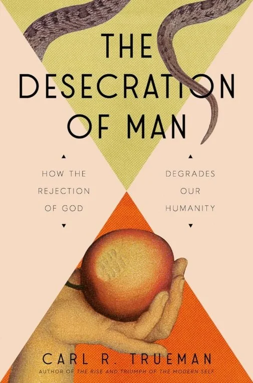
The Desecration of Man
/Midway through his documentary “Why Beauty Matters,” the late Sir Roger Scruton surveys the brutalist wrecks in the hollowed out town center of Reading, a formerly quaint Victorian town updated in mid-century and now derelict, and asks us to look past the broken windows and spray paint. “[W]e shouldn’t blame the vandals,” he says. “This place was built by vandals, and those who added the graffiti merely finished the job.”
We clearly live in an age of vandals, with vandalism lauded as both high art and meaningful political protest, and that is before we even consider darker acts of defacement: the surgical mutilation of human bodies in pursuit of phantom identities, the buying and selling of sex through pornography, the devaluing and destruction of unborn, disabled, and elderly life. But like Scruton looking at Reading, Carl Trueman, in his new book The Desecration of Man: How the Rejection of God Degrades our Humanity, presents us the obvious acts of profanation while asking us to consider the subtler, invisible acts that first made them possible—the graffiti artists as well the architects who provided the already crumbling concrete walls.
Trueman’s project for some years now has been the basic historical task of explaining how we got here. Where his best-known book, The Rise and Triumph of the Modern Self, and his more recent study of critical theory, To Change All Worlds, are big, sweeping books tracing multiple interrelated threads of philosophical and cultural development, The Desecration of Man is a short, brisk book concerned specifically with anthropology—the question What is man? If asking How did we get here? is the fundamental question of the historian, this is the fundamental question of the philosopher and theologian.
Everything else, Trueman demonstrates, is downstream of one’s answer to this question. Invoking Nietzsche’s Madman, Trueman argues that a shift in how both intellectuals and ordinary people answered that question began a long, slow rot that has only recently become obvious. The culture coasted for a long time on shared mores even as the anthropological assumptions that shaped them disintegrated. But the assumptions that man is not transcendent, that he is an atomized individual with no connection to others, that his interior life is his true self, that flesh is just flesh and sex is just stimulation, and that all of these are malleable have in the last century born fruit. A spirit of negation—a phrase borrowed from Goethe’s Mephistopheles—has led to a culture of desecration, the vandalization of mankind.
The surgeries, the “exuberant nastiness” of present day political rhetoric and online Holocaust denial, the public celebrations of aberrant sex, the industrial output and consumption of pornography, the epidemic of abortion or, in a seemingly opposite extreme, IVF, the push for infanticide and the rise of euthanasia regimes, the aims of Silicon Valley transhumanists, and even our consumerist obsession with youth and fitness—all of these treat man as a commodity to be bought, sold, upgraded, or disposed of as if man is just another product. These are desecrations, Trueman argues, and as often as not intentional. The frenzy with which, to choose one example, people are encouraged to take vocal public pride in having killed an unborn child betrays this spirit.
Some of this will be familiar, at least if you’ve read Trueman’s essays or have simply been paying attention. Rousseau, Marx, Freud, and others appear, tearing down the old anthropology and replacing it with their functional, brutalist edifices—the individual unsullied by society, the economic man, the Id. This is succinct and pointed, and should prove enlightening to anyone who hasn’t considered the longer history of how we think about ourselves before. But what Trueman does best is illuminate the logical connection between a debased understanding of what we are and how these outcomes—the spraypaint on the office block and bus stop—naturally result.
At this point it is worth noting, in case this sounds like a straightforwardly conservative polemic, that Trueman is bipartisan in his criticisms. He credits neither side in our current political environment or culture wars with a correct anthropology; both of them embrace the commodification of man in only superficially different ways. The end result is the same.
If a diagnosis were all The Desecration of Man had to offer it would be a good book, but Trueman ends with his most surprising and challenging material: a pair of cautions and a vision of the only true solution to the desecration. He roots both in three inextricably interlocked Cs: creed, cult, and code. Creed he defines as a given set of beliefs; cult, in the technical sense of a body of ritual, as the trappings and practices of those adhering to a creed; and code as the ethics, mores, and courtesies of those believing the creed and practicing the cult.
Trueman offers two examples as cautions. The first, Richard Dawkins, enhanced his already exalted reputation as a biologist by becoming the voice of an aggressive, hostile new form of atheism in the early 2000s. Recently, with the best years of the New Atheists behind him, he began to describe himself as a “cultural Christian,” someone who wants the customs and ethical priorities of the West, which he treats as having emerged apparently ex nihilo and as still viable without the pesky need to believe in God. This, Trueman argues, is a dead end, because it wants only the code but not the cult that sustains it or the creed in which it originates.
It is hard to feel sorry for Dawkins, who has shown himself so clearly to be a man sawing off the limb he has spent his life sitting on. More difficult for me was Trueman’s second test case, the aforementioned Sir Roger Scruton himself.
Even after reading more than a dozen of his many books, Scruton’s precise views of Christianity remain opaque, or at least unclear. There are some signs in interviews and reminiscences that he became more traditionally religious toward the end of his life and his arguments in favor of it clearly come from a deep, sincere place, but the usual tenor of his work is merely to treat Christianity as useful. This was not solely for the way it propped up modern niceties about equality and self-congratulatory do-gooder ethics, like Dawkins, but because it made manifest the transcendent, which is aesthetically and spiritually good for people. Scruton, then, in lauding the faith as a way to bring beauty and a sense of wonder into the world, embraced the code and participated eagerly in the cult, but it seemed not to matter to him one way or the other whether the creed was true.
Other examples could be supplied. Trueman mentions Tom Holland and Jordan Peterson. But this also, Trueman argues, is a dead end. It matters whether the creed is true or not because, if not, the anthropology derived from the creed will be a sham. Once this is discovered, as so many thinkers over the last centuries have so eagerly asserted they have, why maintain it? And so we end up right back where we are.
If the problem is desecration, Trueman writes in his conclusion, having “imagined ourselves as gods” only to “have ironically reduced ourselves to dust,” the solution is the long, slow task of consecration, of taking the thing we have vandalized and treating it as it deserves again. The only way forward is Christianity in accord with those three Cs: belief in God and his vision of what man is and what he is for, teleologically; acted out in community rather than as individuals, in embodied, physical liturgy; and lived out in real-life acts toward flesh-and-blood people: giving, hospitality, neighborliness, even acknowledging our shared mortal limits by attending funerals. These three things are inseparable, and only if taken together may restore our anthropology and begin to undo the vandalism, both the obvious and invisible kinds.
The Desecration of Man is a helpful intellectual history, cultural critique, and religious appeal in one short book, briefly and clearly explained for the widest possible readership. And far from affirming a reader inclined to agree with Trueman, he graciously but clearly points out the weaknesses in much modern rediscovery of the utility of faith. Picking up some of the themes CS Lewis presciently explored in The Abolition of Man eighty years ago, this is a worthy successor to that book, and one that I hope many will find challenging and helpful, not to mention hopeful.

