Infernal topography
/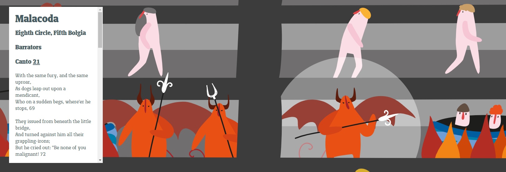
Malacoda, everyone’s favorite farting demon, in Alpaca and Molotro’s “Infernal Topography” interactive map
Yesterday I ran across this great interactive map of Dante’s Inferno, the first third of his Commedia. Developed by Alpaca and Molotro, two Italian design companies, with the support of the Società Dante Alighieri, “Infernal topography” allows you to scroll through Hell from top to bottom, visiting most of the major characters along the way.
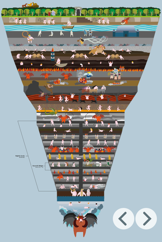
The map has a lot of excellent and intuitive explanatory features. Clicking on a character highlights them, and their name and a portion of the relevant passage of Inferno (in either the original or Henry Wadsworth Longfellow’s English translation) pops up in a sidebar. The sidebar also displays information about each circle, who is punished there, and which cantos of the Inferno you can find it in. Another helpful graphic brackets and labels each particular level as you proceed downward toward “the bottom that devours Judas and Lucifer.” This might prove particularly helpful to students navigating the eight circle, with its subdivision into bolgia filled with different kinds of frauds.
There are also an alphabetical list of the characters in the book, a topographical breakdown of every level of Hell, and a clickable list of the 34 cantos which will take you to the relevant section of the map.
It’s not complete, but it’s really good. The article through which I discovered this describes the design as a “charming, children’s-book-graphic visual presentation” that “ditch[es] accurate human anatomy and horrific violence for a cartoonish video game romp through hell that makes it seem like a super fun, if super weird, place to visit.” I think that’s a little ungenerous. I think the visuals suggest the horrors of Hell well enough and are minimalist enough not to distract from the story itself. More detailed attempts to chart Dante’s Hell, like this famous one by Botticelli, skew toward being too busy to make sense of.
(You can argue that this makes artistic sense, as one of the defining traits of Hell is its pervasive, top-to-bottom noise and confusion, but that’s not usually an asset in visual art.)
It’s a trade off. When trying to reduce a vision as intricate and detailed as Dante’s Commedia to a single visual representation like a map, you can have a detailed but confusing image or an elegant but incomplete one. I love what Alpaca and Molotro have achieved here and appreciate their accomplishment—especially since I love maps, cross-sections, schematics, and illustrated guides as a tool for learning—and I hope this will encourage new readers to encounter the Commedia, students to stick with what can be a challenging, arcane work, and old readers to revisit it.
I just hope that they’ll make similar maps for Purgatorio and Paradiso (now there’s a visual challenge). In the meantime, take a few minutes to browse this map, which you can view in either English or Italian here. And here’s another Open Culture post about other attempts to map the Inferno, from Botticelli to a pretty twee 8-bit version.